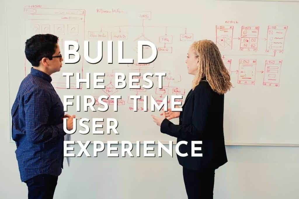
Most major game development studios these days have accepted the “player first” approach. They design everything around the player, starting from the UI and gameplay mechanics all the way to the character and art design. Companies study their target demographic and look at various metrics to get valuable information. Like what type of character art their community prefers, the level of challenge their players like, how much time they spend per session, etc.
We’ve got game companies hiring new internal teams to manage player communities, analytics, UX design, etc. The field of UX is something that game developers know better than anybody else since we’ve always been developing experiences designed to make the player feel good.
Using psychoanalysis and user data, game developers have accumulated decades of experience on how to influence the minds of players subconsciously. And this has resulted in several digital art masterpieces such as The Last Of Us, Portal, Half-Life, Metro, etc. All of these games have combined incredible storytelling with good sound and level design to create truly memorable experiences.
But what is UX? User Experience (shortened to UX) is a discipline of design based around the psychological interaction a user has with a certain product (a game in our case). It is a blanket term covering many aspects of product design and heavily influences the amount of engagement a user has with a certain product.
In the case of a game, UX determines how motivated the player feels to play a game. On a deeper level, it decides how “connected” the player is with the overall experience and what they make of the plot, characters, mechanics, etc. Every single person on your dev team plays a part in UX design, not just those with “designer” in their job title.
Does the player need to scroll all the way down to the end of the @EULA in order to proceed? Does the menu use a grid layout instead of a list? If it is a shooter, do the weapons kill enemies instantly, or is everyone a bullet sponge? Do the weapons have a bit of heft and recoil to them, or do they feel like nerf guns that always stay locked on to the target? All of these things are factored in when creating a good user experience.
First-time user experience is a subsect of UX and refers to the first few minutes of experience a new user has with your product. These first few minutes are critical, as a good first impression will help with engagement and retention. This is especially true in the case of mobile apps, where users will simply swipe your app straight into the trashcan within 60 seconds if they aren’t satisfied.
Each user is different, with varying tastes and preferences, so you can never design a product that will appeal to every single person within the masses. Some like shiny and colorful characters, while others value subtle and refined character art. What you can do is give new players a taste of what your game is all about. Create a tutorial that is intuitive and informative yet as frictionless as possible, so users don’t feel bogged down.
Introduce the “Aha!” moment as soon as you can, i.e., the core gameplay loop. What makes your game fun? Where is the value in your game? Show it to a new player as quickly as you can to get them hooked. Invest in good sound design and crisp animations to increase the perceived production value of your game. This way, players might like it and even recommend it to their friends on social media. Now let us look at 10 ways for you to create the best First-Time User Experience.
Getting Started Should Be Easy

When a player chooses your game from the thousands of other options out there, you should repay the favor by making sure that they can start playing right away. No pesky registration forms, login prompts, or any of those annoying freemium monetization tactics.
If it is a premium game, you should never force the user to create an account or log in via social media right at the start. And in F2P games, you can collect this data through innovative techniques after showing a bit of the gameplay. Like, introduce them to their character within the game world. Have an NPC act as a guide to show them around the place, and then ask the user to create an in-game name.
Then, you can give them the option to connect their Facebook account so friends can see their progression or high scores. This should be skippable, not mandatory. If users get to see what’s fun about your game right at the start, they will probably return to play it. And eventually, they might spend on in-app transactions to progress through the game.
Clash Royale is a fine example of this approach. As soon as you launch the game, you’re placed in a trial match with a bot. It doubles up as a tutorial too. When you complete the trial match, you’re rewarded with a crate, and only then does the game asks you to sync your Google account.
Create A Good UI

A good UI provides the required information, status updates, feedback, etc., right when you need it but does so without hindering your ability to play the game. It tells you exactly what you need to know and then gets out of the way.
The information should be easy to access, and the menus shouldn’t be complicated to navigate. You shouldn’t have to read instructions to use the interface, and tedious or repetitive tasks should be removable with a shortcut key. Loading screens shouldn’t be too long, and cutscenes must be skippable.
A nice example of a game with good UI is The Elder Scrolls III: Morrowind, the predecessor to The Elder Scrolls IV: Oblivion. The UI in Morrowind is a single screen and has 4 untabbed windows for easy access to all information.
All information is arranged in a sensible manner. Character details in the top-left, zoomable map in the top right, a list of all your spells in the bottom right, and your inventory in the bottom left. A really neat feature is the tiny square at the top right of each window which lets you keep a specific window on screen even after you exit menu mode. And all the windows can be resized or moved to suit your preferences.
This allows you to tailor the UI based on your playstyle and current situation. If you see any status indicators you’re unfamiliar with, hovering over them in menu mode will bring up tooltips. Everything bit of information is accessible with just one click, and equipping items is easy (literally drag and drop).
Show The Players Instead Of Telling Them

When you open up Subway Surfers, the game puts you straight into a run with an angry constable and his dog chasing you. You try to slide underneath warning signs, jump over hurdles, all while collecting coins and avoiding oncoming trains. Pretty fun stuff, right? However, the game doesn’t pause itself and shows on-screen tips or reminders to ensure that you’re following along.
Instead, it gives you subtly animated prompts in the middle of the run, showing which direction you need to swipe in. This ensures that you aren’t taken out of the action by some annoying message or tooltip, and you get to experience the mechanics through gameplay instead. People don’t like being lectured, and with reducing attention spans of the average person, you can’t expect them to stick around and read a lengthy tutorial. And, by inserting them right into the action, you can also reward the players with their first achievement right from the beginning!
Subway surfer gives you your very first high score, with some nice victory music playing in the background. All this happens barely 1 minute after you’ve launched the game; now you’ve got a personal record to beat and treasure chests to collect. Do you see how quickly the game eases you into its core loop, its “fun mechanic”?
To summarize, stay away from on-rail tutorials and teach the players by nudging them to complete small in-game actions through gameplay. Reward them with their first achievement right after the first game session, and give them a taste of the progression system (high scores, treasure chests, coins, etc.).
Let Players Choose Their Character

You may like to play strong, brawler-type characters while your friend prefers cunning tricksters. Your other friend might like stealthy assassins. The point is, different players have different preferences. If you’re designing a game with a class-based combat system, you need to include many characters that provide unique advantages.
Varying gameplay styles will cater to a larger audience and give your player the option to feel right at home when they first launch your game. Even if you aren’t designing a class-based combat system and just have a simple 2D platformer, you can integrate this concept through cosmetic customization. If you allow players to choose from various different-looking characters, even though they are fundamentally the same underneath, it will create a sense of personalization.
Don’t Starve is a nice example of a game that applies this concept well. It’s multiplayer and co-op, so there is something unique for everyone in the group. The classes are designed, so they all compliment each other and make up for each others’ shortcomings. Likewise, if you create a simple racing game for the phone, make sure that the player can choose from various cars when they start out. The initial collection of cars may be slow for the sake of progression, but they have to look and feel different.
Early Achievements

Games are incomplete without rewards. You beat a boss, get a new power, unlock a new secret weapon by completing a mission, etc. Or you discover a new area and gain experience points. The best way to get players on board is by offering early rewards for completing miniature achievements like finishing a training round vs. a bot or completing their first match vs. another player.
Once again, we shall take the example of Subway Surfer and Clash Royale. Both are extremely popular games with several million downloads and maintain high active player counts despite being in the mature phase of their lifecycle. This is due to their brilliantly designed FTUE, which generates a frictionless tutorial and rewards players for their first session.
Clash Royale gives you a chest after your training match vs. a bot. This chest may contain a variety of random rewards, ranging from troop cards to gold coins. Subway Surfer follows the same concept, giving you a new personal high score and a bag of coins. This is a short feedback loop in which players complete a quick action and immediately get rewarded for it, i.e., a positive response, which entices them to repeat the loop. This simulates an addictive experience and drives engagement.
Design For The Casual Player
Back during the NES era in the 80s, you didn’t have the freedom to mess up as you do with a lot of games these days. There were no save points mid-level, nor did you get a second chance by watching rewarded videos. Granted, smartphones weren’t a thing back then, but you get the point.
Konami’s Contra is a game renowned for its unforgiving nature, which often turned off a lot of people who weren’t “hardcore” gamers back in the day. Its first 8 levels were insanely tough, and you could get killed by a single bullet from the enemies. Your 12 lives barely gave you any breathing room, and to this day, Contra is considered one of the most difficult games.
Former Nintendo president Satoru Iwata stated in an interview that this extreme difficulty was often a quirk of the game development process itself. Back then, the development teams would spend all night playing their own games, finding bugs in the code. This made them experts at their games, and they were often blinded to the problems a new user might face.
On top of that, user experience wasn’t as big of a topic in the 80s. However, you now have access to instant feedback from players through soft launches. And there are far more avenues to beta test your game, along with plenty of resources to help you create a beginner-friendly experience.
Motivate Progression

Once again, we shall take the examples of classic games to illustrate our point. Remember the original Tetris released for Gameboy and NES back in 1989? This is the 2D puzzle game that started a new trend in game design. Even today, puzzle games are extremely popular.
Especially on mobile. People like completing stuff, whether it be levels in a game or goals in real life. In Tetris, you organize puzzle pieces falling from the sky to prevent them from stacking up and reaching the top of the screen. Simple concept, but it is extremely addictive.
This is because of a psychological phenomenon called the “Zeigarnik Effect.” Back in the 1930s, Bluma Zeigarnik, a Russian psychologist, observed an interesting habit among restaurant waiters. They had developed the memory to remember a large number of complex orders, down to every detail. But after the food had been served to customers, they would be unable to answer exactly what their customers had ordered.
Basically, your brain remembers the information needed to complete unfinished tasks. As soon as the immediate task is complete, that information is no longer required. If you start a task and leave it unfinished, there will be that thought in the back of your head urging you to complete it.
So how to apply this system in games? Use progress bars to indicate how much time is left on an upgrade. Or how many experience points you need in order to advance to the next level. Clash of Clans uses these tactics, which urges new players to stick around and experience more of the game as they do one task after another. Upgrade archers, then construct a wall, train Vikings, etc. All this within the first few minutes of you launching the game. Timers show you the progress, so you either stick around or come back after a while.
Design For Playability And Fun

If you get this one right, the rest won’t matter as much. A fun game will keep new players interested, even if there are some minor flaws with the UI or tutorials. The prime example of this concept is Flappy Birds. Sure, it didn’t have the best graphics or UI. The soundtrack was basic, and intuitive gestures weren’t a thing.
But it became a chart-topper on the App Store because the core gameplay was really fun. People loved it, even though all you did was tap. Yes, it could get quite frustrating at times. This definitely wasn’t an easy game, designed with naive players in mind. But it grew on people, and they started to love it. The barebones design ended up working in its favor because it allowed players to focus on the vital stuff.
Use Bright Colors And Attractive Artwork
This one comes in handy if you’re creating a game catered towards a casual audience. Kids, senior citizens, parents, office workers, etc., who don’t really play games on console or PC but are willing to open up a game on their phone every now and then.
Candy Crush is the prime example of this strategy, evident from its colorful and shiny candy. They also use particle effects, and victory sounds to provide positive feedback whenever the player executes even the most basic move (similar to slot machines in a casino). Stylized and large fonts, cute characters, giant menu buttons, etc., are used by most mobile games to hook new players quickly.
Provide Hints On Loading Screens
A common practice adopted by both mobile games and PC/ console games. By providing new users with helpful advice on the loading screen, you are accomplishing two things.
First, you are making sure that they get a sense of what the game is about and how to play through it. Secondly, you dampen the effect of having to watch a loading screen. With some nice artwork in the background and a tip in the foreground, you occupy the player’s brain and buy yourself some time to load a level.
The tips can range from advice on basic gameplay mechanics to detailed character rundowns in strategy or RPG games. And make sure also to include a progress bar for the loading screen alongside the tips. Clash of Clans and Subway Surfers are two mobile games that use loading screen hints. Plenty of PC games also use them, like Dota 2, World of Warcraft, Skyrim, etc.
Conclusion
For basics, make sure you’ve tested your game to be bug and glitch-free. Even if you have a fun game with interesting artwork, performance issues and dysfunctional features will ruin the experience for new users. A great idea would be to highlight the fun early on, during the first session.
Showcase the progression system and what types of rewards your game has. How will the player earn in-game resources to unlock exclusive power-ups and rewards, what is the ultimate goal of the game, etc.? If you’ve got a freemium monetization model, demonstrate the value of spending virtual currency by giving the player some free coins at the start.
Then, simulate a situation in which they need to spend. For example, you’ve designed a tower defense game in which turrets, booby traps, etc., can be upgraded with gold coins. Give the player some coins to obtain a level 2 turret right at the start, showing them the benefits of higher-level defenses. And another great tip is to gradually reveal new techniques to the player after the tutorial has ended. This will boost engagement while also showing the player that there is much more to the game than they initially thought.